work shops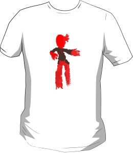

This is my shirt idea for a Zombie, that I did on illustrator using squares and circles. I didn’t have tome to add clothing except for a jacket

I used a template of shapes and used them to create this image. I could only change the colour, size and the orientation of the shapes. I randomly placed there shapes and went from there. I tried to thing that the white triangle as an eye and the boxes where legs. The colourful circles and small triangles where just way to show the white triangle and the boxes with white triangles are there for a pattern but it could look like a mouth and the black circles and orange triangles on the top side of the image could be arms or to draw attention to the object below.
Rhythm
Regular rhythm 


All the pictures above follow regular rhythm in some way, with repetition of shapes or objects by having such as widows or lines in the same position but being parallel to each other makes them regular rhythm.
Flowing rhythm


Flowing rhythm is usually organic motion. It doesn’t need to move but could show the form of motion such as an animation frame by frame sequences in a single image. like the first picture of the tree shows the motion of the branches going up even though they do not meet thy are organ and have a flow of motion. even though the last one in’t organic it is a fan with is moving, repeating the cycle of fist going left than right.
Progressive rhythm


The last rhythm ids progressive. This rhythm use the person’s point of view from one point to another, known as perspective. Even thaw the object them self don’t need to be in a straight line but still gives the elution of a line that your eyes can follow a perspective view.

This is my own regular rhythm image I did on illustrator. As you can see there are 4 rectangles with each of them being a little different but the same potion and then I rotated them and go this mirror type effect.

This one is my own flowing rhythm image. It has all the aspect of a flowing rhythm such as the wings looking like hey are curling with a flow of the motion with shapes.

This is a Progressive image I created quickly. it used the progressive method of perspective form the left end it looks like its bigger then the right end, which looks smoker.
Analyzing deign ideas

This image has seven text fields that are aligned to the right. one of them has as contrast of a white then the other six, top make the viewer notice it more than the others the others have a faded grey to show there less significant than the first one. The grey texts has repetition colour and because its proximity it could be that they are in a same category but a different information. the name of the site is aligned corner to the left and some thing that is bold and noticeable, big and in the centre so the viewer would see it first.

This image has a black and white contrast. the name is big and noticeable, aligned on the bottom with to stand out and then the sub heading is also white but the text underneath is grey so that the viewer would notices the headings first and then the other text it also uses repetition. With the subheading and the text under underneath it uses proximity with a faded line to show a group.
This images proximate and aligned is hardly being shown and it’s contest is very limited to black text. The image on the back makes the black texts stand out but because of this images constant repetition of texts alignment is only being seen at two places of the image.
I created a sketch type of concept for this image because this man changed the way of design so I thought it would be a good idea as a base from the style, going back to the drawing board in a way.

this page was a website for dogs. this webpage didn’t have any structure that the viewer can track or see in the most simplest way without culturing up the page space. That’s what I tried to do, first I changed the menu bar and added colours to show the different selections and condensed the page subjects into smaller sections and layered the text and pictures into group with lines separating them. and a liner garden so the viewer would start from the top and work their way down as it fades.
Textures
2D and 3D
the differences between 2D and 3D textures are that 2D can only be seen in way that it seems its real or it exists, it only has one few. giving a limitation as if it can be touched even tough its only an image that has ben colour and shading to make it believable but stanf=d out from real life objects(cartoony, anime etc). 3D is when the texture is actually is really, it exists in the fiscal world that we can interact with and touch it, the texture is built up by shading and shadows, which can be seen because of light refraction between the objects surfaces that has been build up to create a texture(s).
Visual and Tactile
visual is where the texture is seen as if can be touched but is probably jus an image that has either been taken by a camera or created to be seen as if it would be in real life, this would be used in games to give the viewer the experiences of realty in the game.
Tactile is physical objects not an image it acumen be touched be fooled and whiter you can do in real life.
Motif
A motif is a feature that repost in design image. it acumen be anything as long as it has a way to repeat it self such as wig=ht and black boxes or lines that would look smiles if more than one would be put together and there wouldn’t be gapes or some thing out-of-place when compiled.

i got this image from the website and as the website told me UI entered the image I indeed really trim it because I didn’t thing I needed to and I was right because my image turn out fine. I learned how to use the clown tool today and from that I used the Rough Dry Brush to achieve my texture. the first time I finished I only got the left and right sections but for got the bottom and top so it didn’t look seamless, the next time I did work because I fixed my mistake.
Banners

I fist bot this image and trimmed the edges so the boxes would align when placed in a line. I steed simple first so than i can get the hang of it.

This the finished version of the banner.

This the sec in one I did for the banner. the darted out as having a dot of light in the middle. i used the clone tool a few times to get the right shade of the light right but when I placed this picture and two more copies into a straight line there was a slight line tag didn’t mach so using he clone tool again I fixed it and got this rinsed one.

This the sec banner.
 This the there’d image used. I fires cot the image then tried to get the image to be an Motif, than coupled there like this into a straight line and then by us the clone tool to clones lighter shade of the texture because it didn’t match. so I fixed it in order to make the texture look seamless. tis is my result.
I thought that this might be a bit difficult to do but it trend out better than expected.

this a star in the a design principle for a website template. This was a task to get into the knowledge of web design.
Paper Prototype
The group had thought of good ideas and well thought out ides for the app’s functionality. With the simulated sliding and drawn on touch type buttons. I was the one how was describing what to do but in my haste I forgot to as questions that would help to develop and change the product. and there’s too much hesitation
Wirframing

This is a wirgrame for a state agent website. I pet the frame as simple as I could;d with all the information that the viewer. like the houses that are on the market, houses that are up sail with a left and right buttons so if the viewer can see another house if they don’t liker the ones there. slide dow menus for categories that they can see hoses in the categories they have been give(ratings) location, which show the house here the location that the viewer toys in and Houses, which shows hoses that are recently been added or show a specific name. images, a slogan and the live likes for social media and main products with stars are there so that the website looks trustworthy and other people are involved as well.
Research
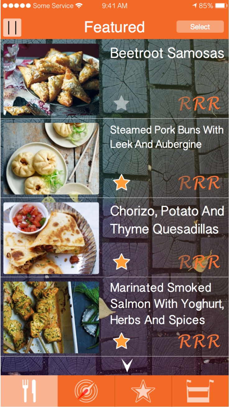
These App is used to find foods restaurants.

http://www.forbes.com/sites/tomiogeron/2011/08/25/ness-brings-personalized-touch-to-mobile-search/

http://appcrawlr.com/ios/ness-dining-guide-restaurant-se
the app as a easy and quick way of finding something, with feedback from others with star ratings and likes, with the percentages. I if you go to a review a location of the restaurent acres can bee seen when you tap on the top right hand corrner. this very useful when looking for a place to eat.
the apps main apple is reviews from people and there likes and dislikes, with he option of sharing means more people would purchase the app.
IrishFood


The app is quite simple. It show all the Irish food you can find with a visual image and name that is listed in the app, then we it is clicked it show a picture of the food with three buton categories. ingredients, direction and note, which has extra inform action about the food with a opinion.
the app is very easy to use and very informative, witch is very important when when it come to functionality. this an aspect that I will need to think about wen it comes to my paper prototyping.
Just eat
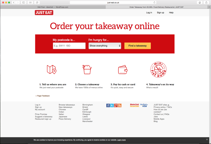
The website for just eat is simple, it has the the finding method for food =as soon as you visit the site. This a good way for people to find the food they are looking for very quickly.
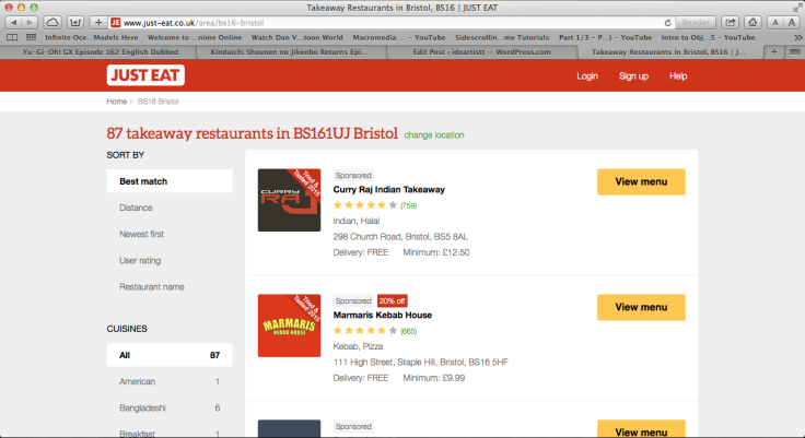
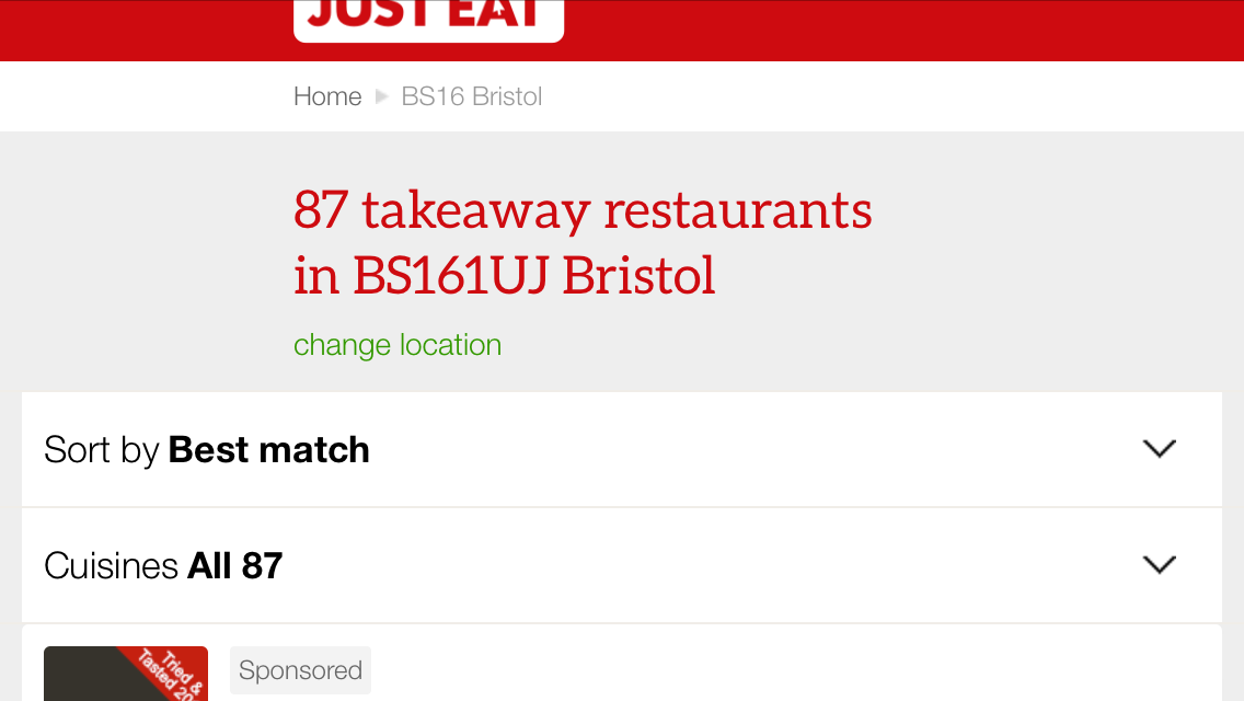
When I use the same website and the same search, the webpage adapts to my phone size a more manageable view so I can still see the results. However the list on the left side on the desktop is gone from the phone view because of that size restraint


Horizontal view


With the app, it dose the exact same thing but is optimised for phones, it gives you the option of collecting or delivering for the choice of food you are ordering. Having as many options for the user is best,which is what I will be thinking about when I’m coming up with a paper Prototype.
Hungry house
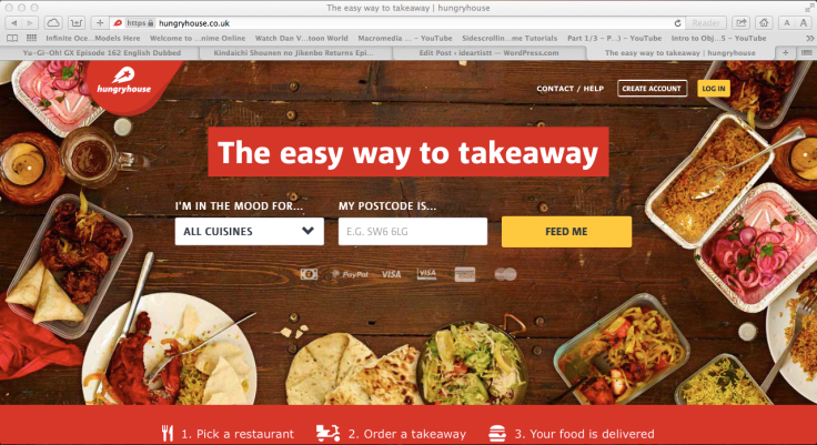
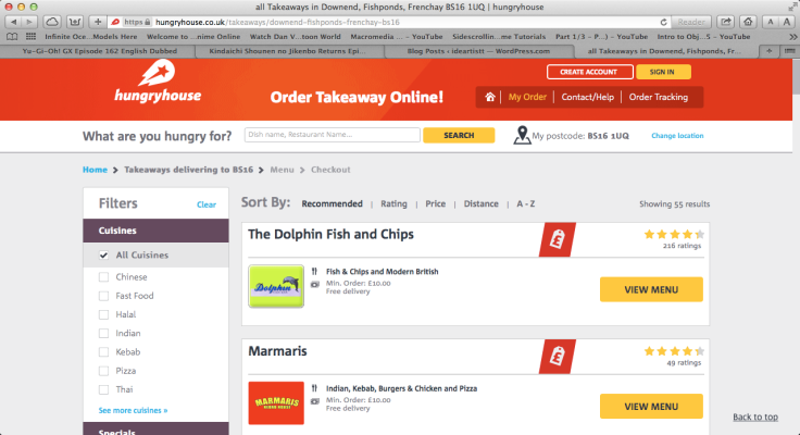
Like the just eat website the the way the we site is set out is almost the same, it ha the rider with postcode and in which category of food but HH has more visuals and has a sleigh more information like offers and what bank card they can use. both HH and JE have the same colour scheme going with red and white, the two companies where thing the same when designing there website, which might be the very reason why theses two website are so successful for there companyies


even the app is vertualy the same, with a different tool bar in the bottom and on the HH app it gives the option to create or sign in to the app’s server. This might be a good thing to think about when I’m coming up with my design for the website.
Bristol foodie

This website has agood way of showing food in a simple and visual way. This some thing I will might included and develop it in my own way.
Proposal
Date:7/12/15 |
Section 1Working title: Food on the go Place To Pace Move and find Food tag Food to place Foreign gourmet The target market is for thaws how love food, aged young and old. Typically the individual is someone who has a busy lifestyle and likes tasting lots of different cuisine. The target marketer will often be on the go and love regional and international travel and want to find the best food the street has to offer. What you will work towards producing: (Detailed description of your proposal) I will work towards creating designs: for a website that can be viewed in a browse, both on a phone and on a PC, and a app for phones and tablet devises that incorporates the different and unique features that the phone(s) and tablet(s) can use. I will also work towards creating a custom style, that will hold ideas for features and a logo that the website and app will hold. |
Section 2Influences, starting points and contextual references:I’m influenced by the two most know websites/apps, Hungry House and Just Eat. As the brief asks us to create awareness for street food on a higher scale, looking at a yearly establishments in the center, named the German market that sells foreign food. This is a good place to star what kind of food people like.Early ideas research and sources: (What are your sources for contextual and personal research?)My research for idea would start from either Just Eat or Hungry House, the way the yare structured and work according to there functionality with the user. Finding apps and websites that feature different ways of structuring there navigation would help to come up with ideas for my website and app. |
Section 3Intended techniques, non digital and digital processes:I will be using the software named iDraw to crate my buttons banners or anything else needed that would be used to interactive with, and then use Photoshop to compile and place everything together to create visuals for desktop and app views.Timescales: (Please insert weekly targets of what you intend to work on from the beginning to the end of the project)23/11/15 – 07/12/15During this dates I will be researching to help me coming up with and develop ideas to be included in my paper prototype(s) and wireframie(s). and complete the proposal for this unit. Start coming up with icon and logo ideas14/12/15 -04/01/16Start creating paper prototypes and wireframing examples with my ideas and features I came up with to be used in the website and app. Gather information using the two methods to develop and create my final visuals for the projects.11/01/16Pre-check anything before cratering my visuals, if need be changed or develop an idea(s) (if I think of any of any)18/01/16 – 01/02/16Create all the visuals for the website view and create all the app visuals for phones and tablets. Start and finish evaluation. |
Section 4Proposed methods of evaluation: (How will you evaluate your project?)I will use my own work for the evaluation, starting form the research to the final outcome that will be on my blog. I will also use some students as a way for feedback and along with the results from the paper prototype(s) and wirerframe(s). Alongside this my own input on the work will also go into the evaluating stage. |
Ideas Generation
As I was researching, I came up with the idea to have a language Changer feature on the website and app for foreign visitors and for those who would use the app to add there own food info, who can type up in there first language. This idea is also good way for foreign languages to be translated into the reader’s dominant language.
I was thinking on the website, to have all the login and create functions as buttons, where a tab is shown on a login button, a small box underneath or net would aper sliding downs from the log in button and if the person doesn’t have an account the tabs shows a create an acount or use Facebook to login instead of going to another page.
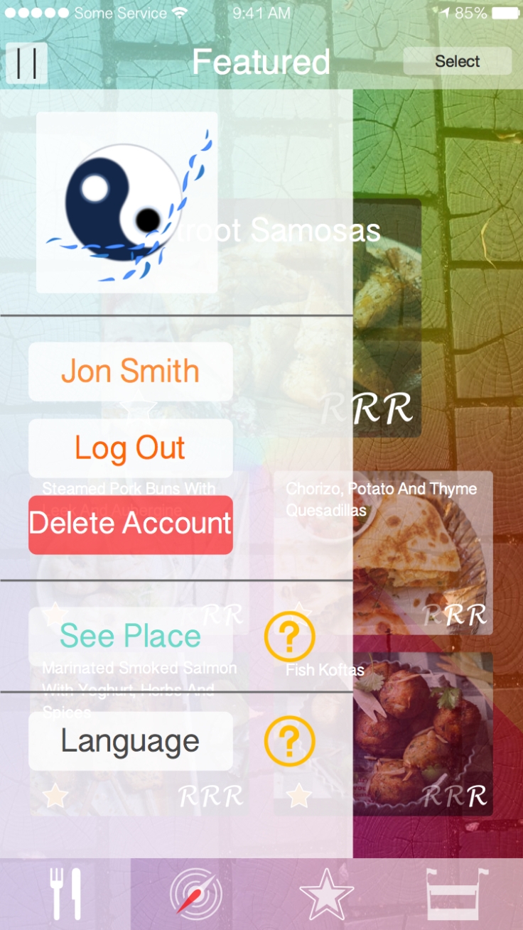
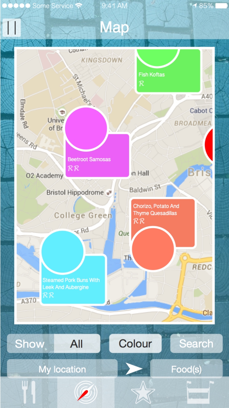
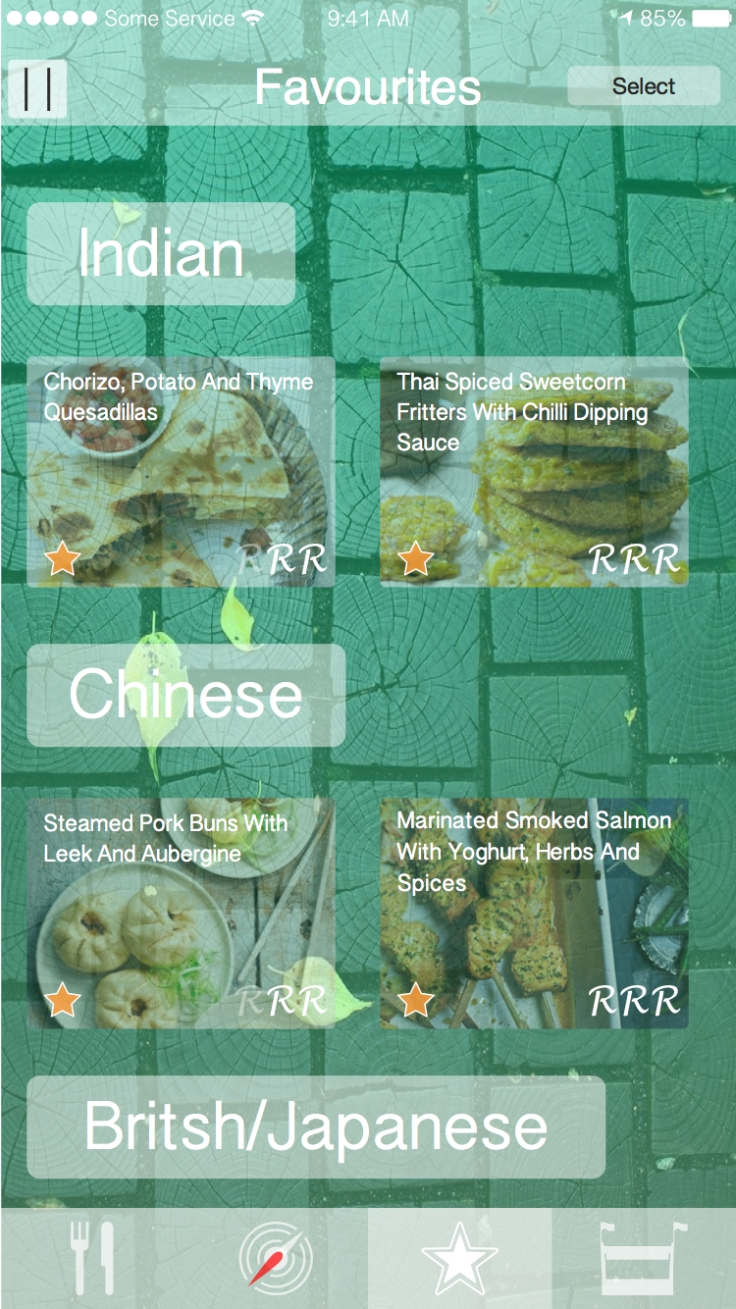
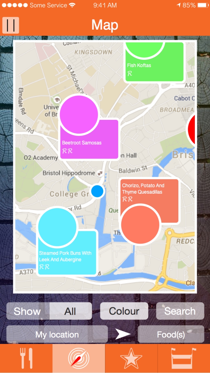
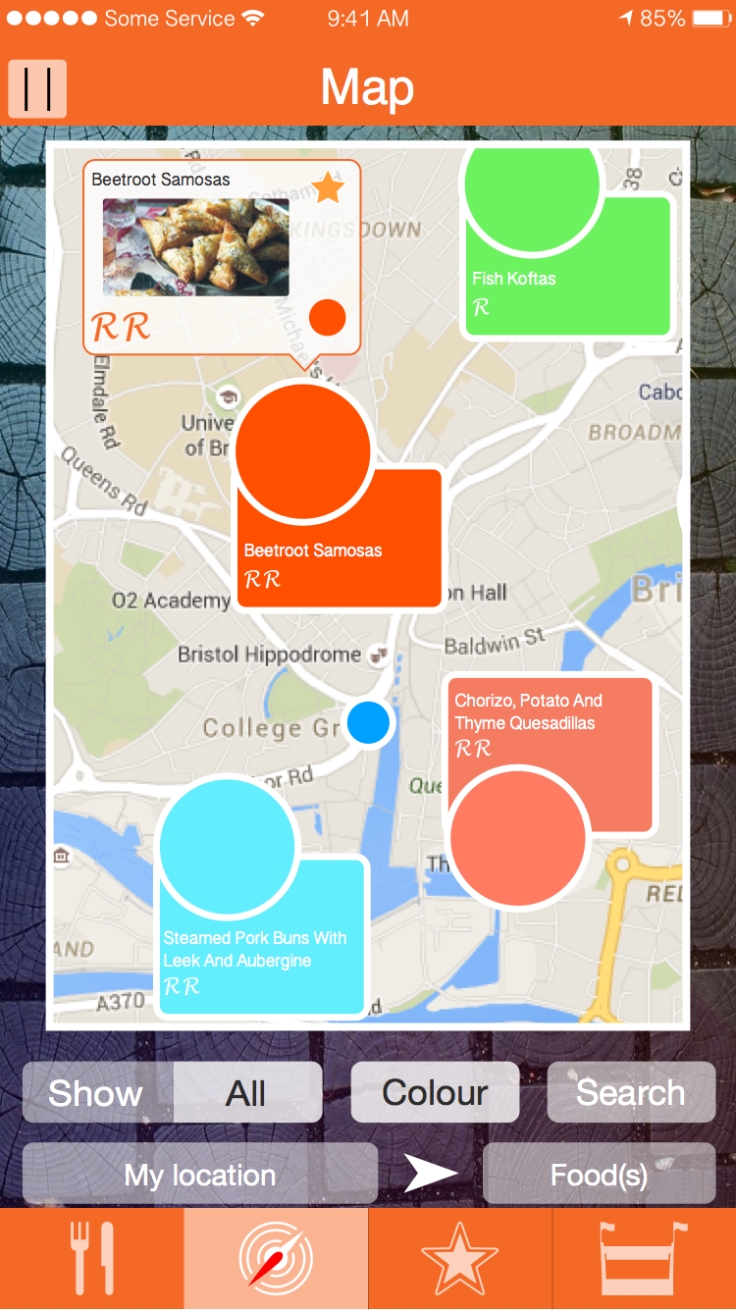
With the suggest one of adding geo-tagging as a feature to be included, as a way to fined venders on a map. I was thing to have a favourites section, with a simple click on a icon below or next to the name of the vender and then on the main page of the website or app, a map view would show all the locations of the venders that are in the persons’ “favorites”. I was thinking that, to notice them more easily, the location icons would have an individual colour and if the colour might be the same or not to the liking of the person, the colour can be changed by tapping on the icon that holds the colour.
On the app, having a slider to access the “settings”, “create a place”; for venders and the login and out buttons. And along side those feature, the change languages button would be included , so its east to change and change back.
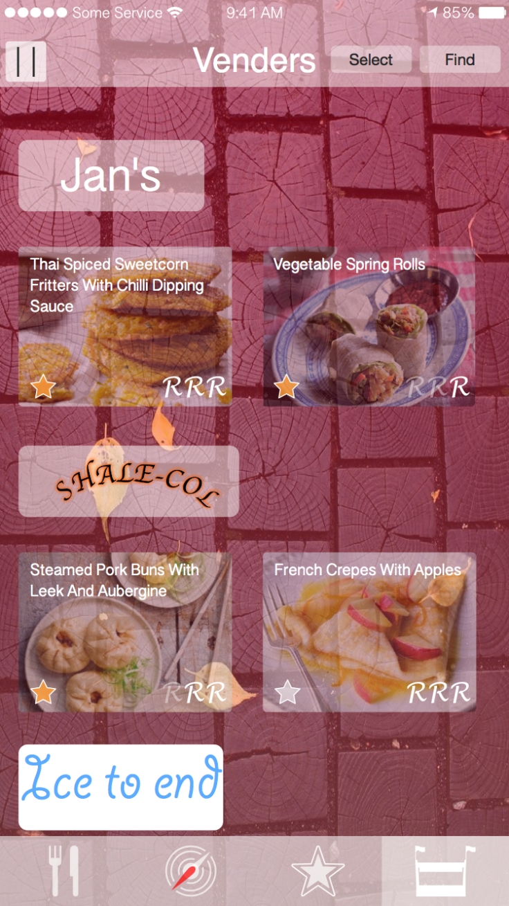
I wanted the viewer to see the foods in the most visual way as possible but still having the information to let the viewer know about the food.
I was thinking on the website view to have the tool bar to be on the side of the page.
I was thinking for my style of the website and the app, I want a transparent type few, so colours and some images are see throw.
I came up with some ideas on paper suing aspired diagram.

Logo ideas
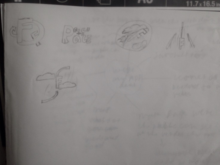
I come up with some ides on paper on how my logo ccould look.
Ideas Development
Logo deigns

Throw some ides, I developed my logo ideas on the computer and created some ideas, along with some alternative ideas for my log to see how thew would look and chocse the best one.
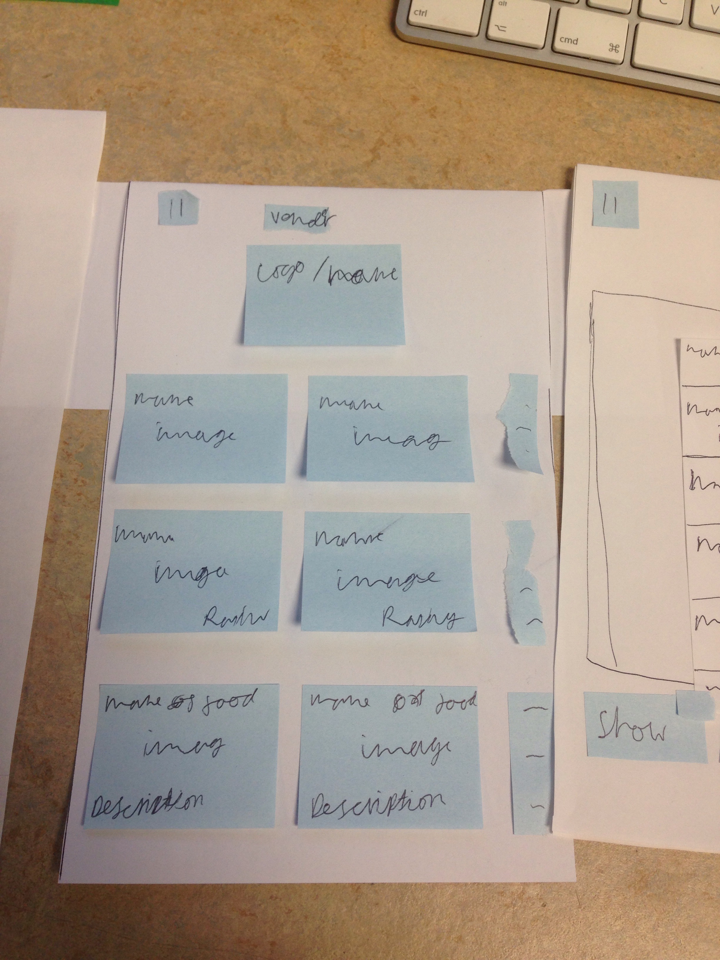
Paper prototype


https://www.youtube.com/watch?v=ua9Vc2wwqWU
I created my paper prototype for the IOS app view, I create bunch of panels and stick notes with the app’s features, such as the food display.For the extention tabs, so I got extra peaces f paper that would arch to the buttons using pot it nots. if I need to I could change the post it note or replace the idea with some thing else really quickly.
I test my proposed app prototype to some one. I navigated all the sections, except for the favourite section because of my phone stoping, but despitre that I did get feedback. The person who did this paper prototype didn’t complain or have a hard time figuring out the in tell about the test app, he navigated through with hardly an problems, so what I’m doing is on the right lines.
Wierframing
I did my |Wirfraqing and the result was overall good, I had thought of every ting according to the person how was testing my idea. I made the wirframe a bit more deatailed then the prototype so it can be viewed and understood a bit beter then the prototype.
From that result I did a suggestion of adding timeframe for the venders being open or cold, and I could ad a way to allow the vender to also tell the public if there closed fro the day or won’t be oping for a while, because there on holiday for example.
I forgot to add a way for the user to give the food a rating. I could add the section underneath the image of the said food, with a three star rating system that would average the overall account of ratings.
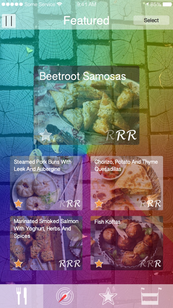
Produce Outcome

Logo
![]()
I finally chose the logo. I whet with the simple orenge flame type text with the white “to” and the bold black text for “place”.
App Icon
![]()
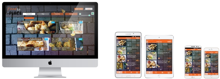
Iphone 6
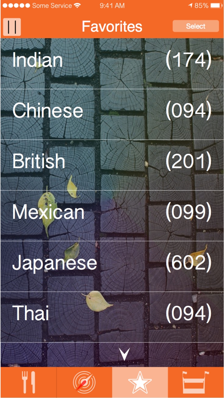
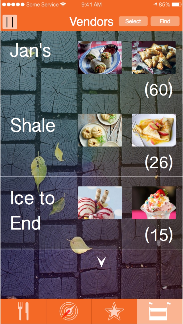
The six visuals of the app

Final Evaluation
We where asked to create a street food app and webpage designs for unit 3, ideas and concept. We had to create designs for how a street food app would look on an Apple’s IOS iPhone and a 7-inch iPad, along with an android operated phone and a 7-inch tablet, with a webpage for a desktop. We also had to crate the log and the icon for the app. We where also had take in account for the features each devices has or could offer, such as geo-tagging or the size of the screen.
After going through the brief, I went online and researched bout food apps and websites, to see how they look and how they are structured in order for me to create my own street food designs. I looked at to certain businesses that offer the same type of feature, Hungry House and Just Eat. These two rivals allow local food establishments to sell there food with delivery, they both have an app and a website to use. Their apps and websites are almost compiled and structured the same. This made thing helpful for me, so I can see how there website and app differs and what has bee kept the same. From this I learned that is would be best to have icons for the tool bar for the app designs, so it would take up some much space with text but keep text on webpage. I also looked at individual aps and websites to see what type of designs are out there.
As I was researching, I came up with ideas and aspects of what could be in my street food app and website. After I had reassured and had a good understanding on what I could do I stared thinking about logo designs and coming up with more ideas that I could include into my street food app or website. Such as language changer or the icons on the map view to have individual colour so the view can see the different food locations. I wrote some ideas down on a spider diagram, which helped to have features like the main page having the newest food a bit more bigger, so the vender can showcase there food without it being underwhelmed by what’s popular.
I first created a paper prototype including the ideas. I came up with and added some I thought of when design the simple prototype template for my app. After finishing my paper prototype, I test it on a student in the room. I although my phone could not record all the paper prototype, the tester didn’t seem to have much problems navigating through the prototype, so I was on the right track with this unit.
When I created my wireframe for my street food app on illustrator. I make it a bit interactive, using layers to views tabs, pages or changes that will happen when the tester will tap on a button. This time the full video was recorded so I managed to notify the tester, all of the features of the app. This time I tested on some else. Same as the fist, the second testator did not have much difficulty on navigating through my wireframe, although the she did have a slight problem on understanding the app but that’s probably my fault on communication. According to hire, I had pretty much come up with every thing and theirs not much that she could add to it. Although she did made me realise tat I for got to add a way for people to rate the app and suggested to added a section to let the public know, what time their open and closed.
When I was created my logo deigns I create a 6 by 5 set of designs. I spent a while trying to figure out the best one use fore my street food webpage. I asked a few people on there opinion and gave me a bit more clear idea on which one to use.
When I was creating my visuals, I kept the theme of street food by having the main back drop to be a section of path, some leaves, with a rainbow pinwheel slightly translucent, to suggest the colourful nature that British street food has to offer. I kept the translucent type effect with the buttons and icons, so it doesn’t feel like the app and website is restricting and by creates a contrast I crated a way for people to see dominances from images to text even the icons. When I was creating my webpage visuals, I through of a new feature, which scales the screen. I placed it on the top right corner. The entire visual took more then then I expected but even so I got my street food app and website visuals finished, looking the way I wanted to be when I was thinking of ideas and as I whet through the idea and development stages my project became more professional.
I think it was a successful project because I created all visuales, logo and icon for the street food app and website. However when i was doing my project’s paper prototype and wirframing, took longer then expected but even so I merged to stay on schedule and finish my project.
If I had more time I could spend a bit more thought on the logo, come up with more efficient method to use the street food app and webpage. I could also spend a bit more time on getting the dominances of colours and the opacity a bit sharper then it is now. I did get a comment to change he opacity of the the rainbow pinwheel, over the backdrop of the main page to be lowered so that the image of foods could be seen a bit better. If i had time i would work on getting the right levels of the opacity.
Re-submition
App icon

Full view
The six views on the app


April 2, 2017 at 4:19 pm
A person’s content signifies your %BT% problem indeed naturally!
Personally i think for instance I`m motivated to eventually pass my
own composition through this issue. But yet, probably smb may help by myself with all the introductory?)
LikeLike